Movie Concessions App
The Brief
Design an app for ordering movie theater concessions
Problem Statement
Current food ordering within movie theater apps require an excessive number of taps in and out of menus, frustrating users and reducing sales
Software and Tools
Hand Wire Framing // Figma // Adobe Photoshop // Rotato // Transmit FTP // Personal Web Host
5 Week Design
Role: Solo Product Designer
Discovering user needs
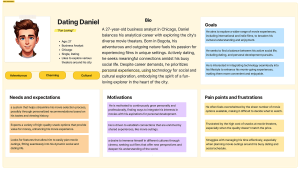
I created two personas and explored their needs through empathy maps and user journeys, illuminating pain points and helped narrow the focus of my study for this concept
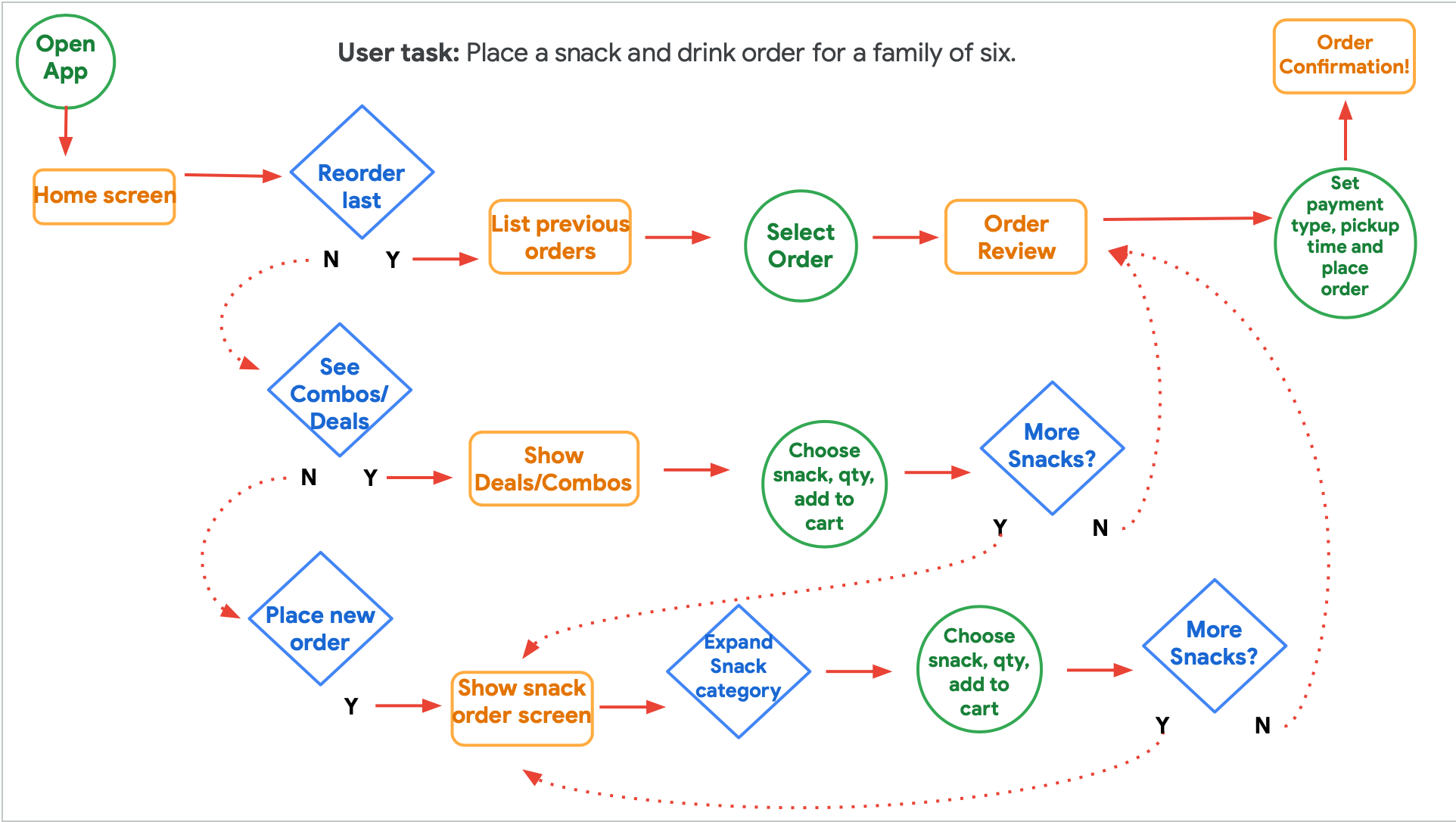
Optimized Order Flow
As I began to explore this concept, I was drawn to develop information-rich screens that required less scrolling and fewer steps to complete a task compared to the typical order-creation flow found in competitor’s apps.
A primary goal for the design is to provide users with the opportunity to add items to the cart directly from menu screens rather than only from an item screen. This reduces time spent navigating up/down the menu structure and tap-fatigue found in many menu-based apps.
I used “The Current State of Checkout,” a 2021 Baymard Institute Study, to draw key insights into the UX difficulties faced across 71 different e-commerce websites. I was not intent to build every step of the checkout experience for my concept, but it was crucial background as I began shaping the flow through the concessions app flow.
Competitive Analysis
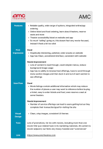
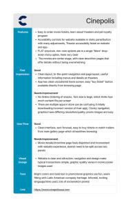
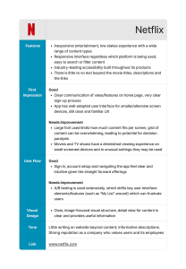
Understanding how mobile ordering is offered by both national chains and smaller theaters gave me a broad view of approaches and opportunities.
- AMC Summary
- Cinepolis Summary
- Netflix Summary
Hand Wire Frame Explorations
Goal Statement
“This mobile app will let users with complex or repeat orders quickly order what they want using favorites and order new items quickly with minimal taps”
User experience can be evaluated through reduction in steps in the user journey or time on task compared to competitor’s apps.
dFeatures within Reach
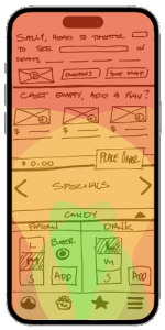
- Typical Grip Zones
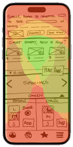
- Shifted Grip Zones
I located primary app features and buttons within typical reach zones for left and right handed users,
I also verified shifted-grip reach zones allow for confident selection of all high-frequency features and menu items.
Low Fidelity Prototype
Once the paper wire frames had been reviewed and refined, I used Figma to study the scale of interface elements and layouts and learn the practical considerations of wiring up an interactive prototype for user testing.
Low-Fi Prototype
High Fidelity Design Iteration
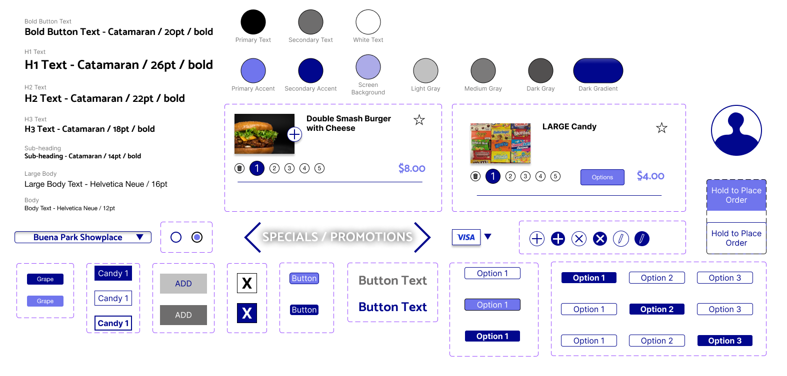
Developing the prototype allowed me to refine the visual hierarchy and ultimately create a consistent, engaging interface to guide users to important functions.
The initial figma assets were styled and refined to reduce interface complexity and to streamline design iteration by reducing variant and asset count.
