Product-Launch Website
The Brief
Design a responsive website to showcase a unique new cannabis storage product and to collect survey responses
Problem Statement
A start-up is making a stylish cannabis storage case and wants potential buyers to understand its unique features and advantages
Software and Tools
Hand Wire Framing // Figma // ChatGPT4 // Google Survey // Adobe Photoshop // Transmit FTP // Personal Web Host
4 Week Paid Project
Role: Product Designer // Website Builder
Personas with ChatGPT
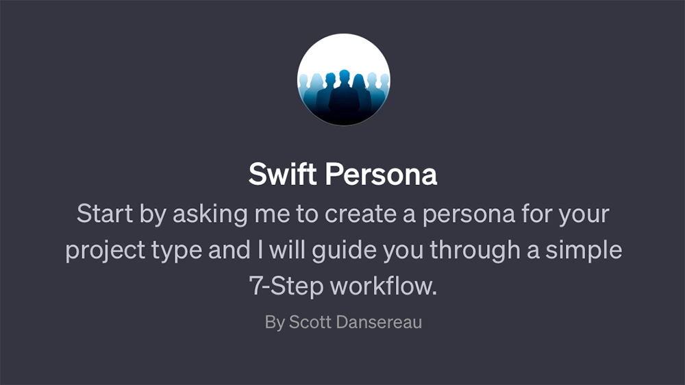
I used characteristics from the client’s target demographic to generate three personas using Figma and Swift Persona, my custom ChatGPT4 -powered persona-builder
-
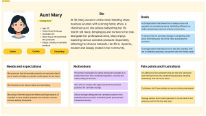
- Aunt Mary
-
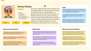

- Groovy Granny’s AI-Generated Persona (Formatted by a Human 😉
-

- Mello Mom
Building an AI tool to develop richly detailed personas
The client stressed the importance of how this product is targeting women of various backgrounds and ages. To properly address this need, I wanted to create diverse and interesting personas to inform design decisions.
To add depth to the persona creation process, I build a custom GPT, Swift Persona, which starts with a handful of key questions and traits that are used to build a rich and varied persona.
Designers that already have data about their personas can easily incorporate them to improve accuracy. The ability to move through this process by typing just a handful of characteristics is seamless and the ability to fine-tune each step empowers designers to tailor the AI responses.
Paper Wire Frame Explorations
Goal Statement
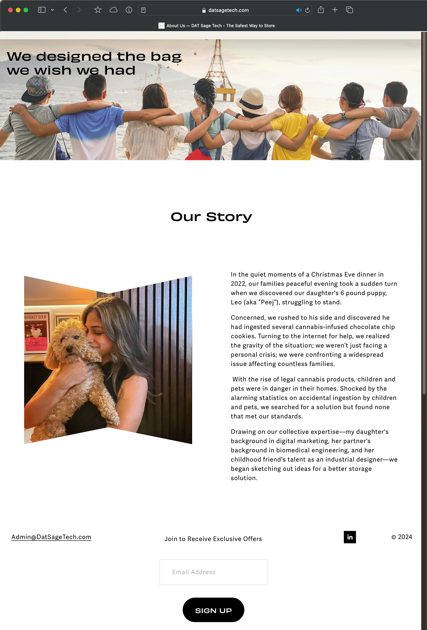
The website will engage potential customers through a vibrant design and demonstrate the unique product features and company ethos.
The KPI for success is to collect 5,000 survey responses for future product marketing campaigns.
Evaluating Requirements

The existing site was considered a placeholder by the client, however I began with an evaluation of the site to understand how it had been structured and styled.
The home page had most of the elements the final design would require, but did not a focus visitors on the product and survey
Low Fidelity Wireframes
Review of the paper wireframes took place in a Zoom working session with the client team, resulting in important refinements in content and flow
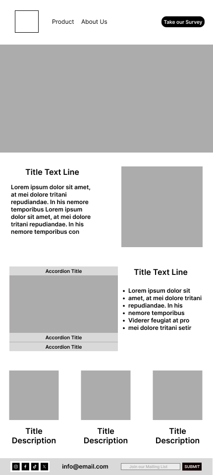
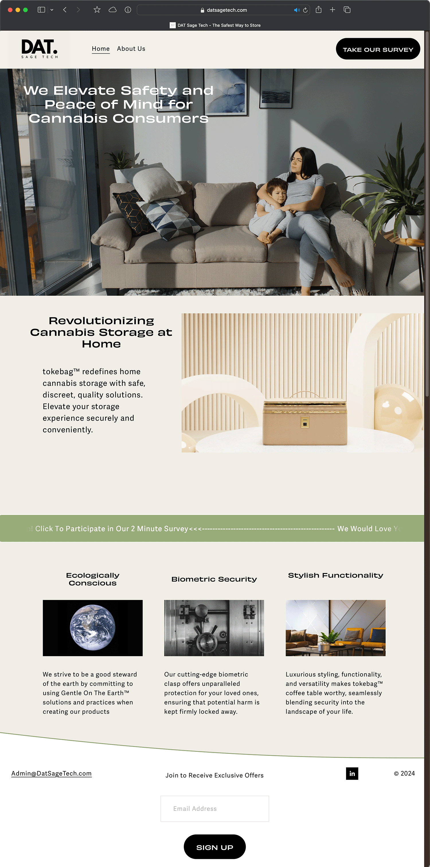
The product page was designed for easy scanning, with key information available in simple bulleted lists, or image-focused layouts to guide the users path through the information easily, or allow them to find what they are interested in quickly.
The full-bleed main image is meant to give an immersive vignette of the product. The survey CTA is given visual weight to balance against the three features laid out below.
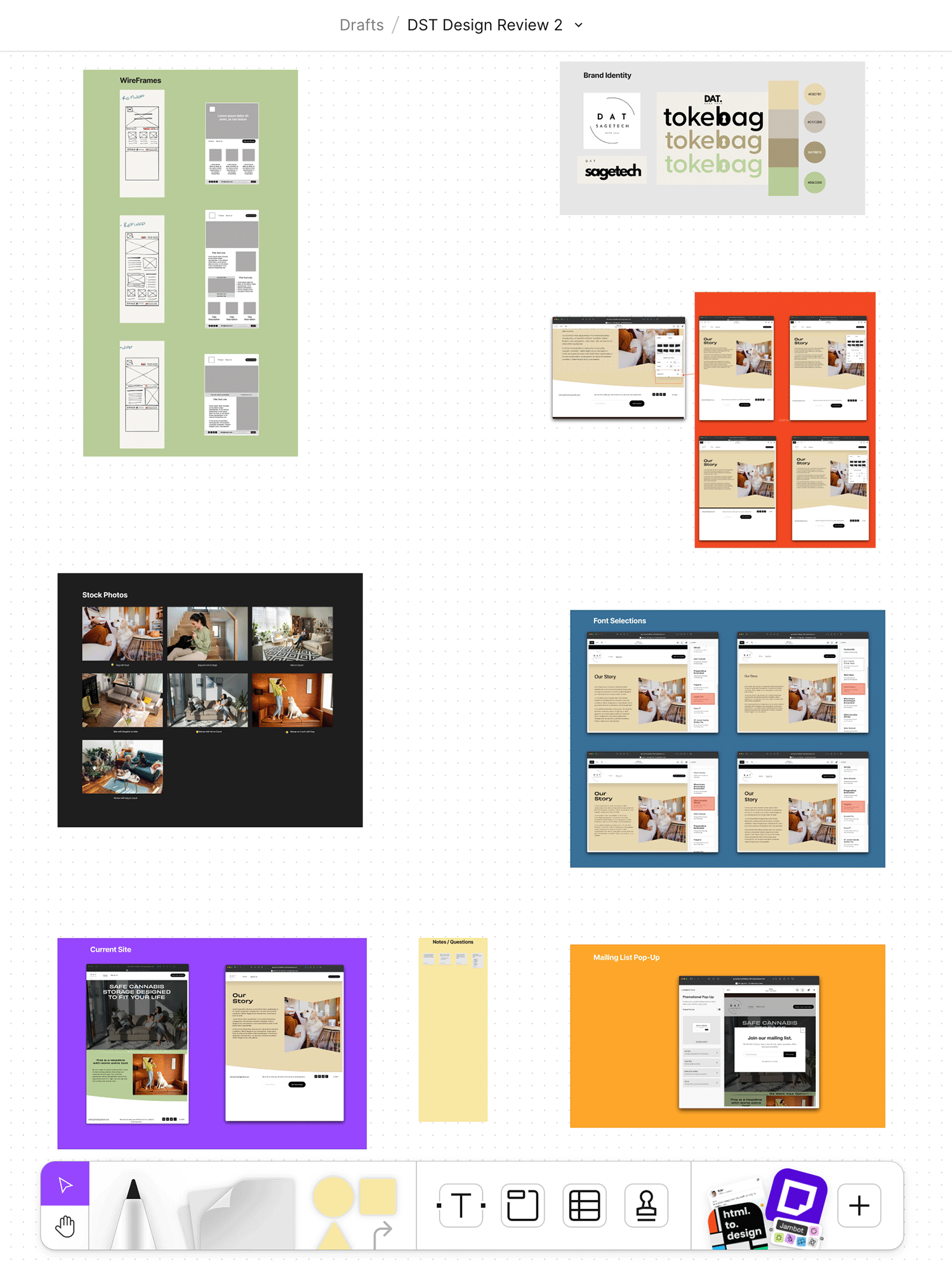
Design Review 2: Presenting the Initial Draft
I presented the low fidelity wireframes and the initial edits over Zoom to the client team. I wanted to gauge their opinions on a few key elements like Fonts, and website styling details.
More substantive conversation developed around the copy editing and imagery that would be used for the site. These are outside my project scope, however I assisted with determining content length, information flow and content layout that would best suit their communication goals.

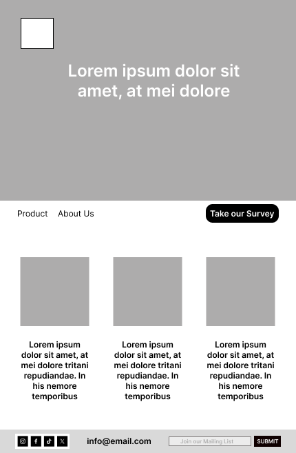
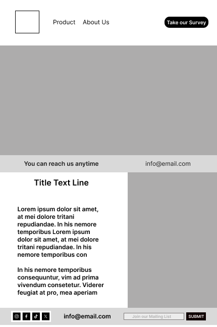
Final Designs
Landing Page
About Page